
Evolution of Print Advertising in North America Throughout the 20th Century
The dawn of the 20th century created a shift in North American society. With the rise of industrialization, society was moving forward faster than ever before. And it wasn’t only the industries, but consumers as well. Walter D. Scott, a 19th and 20th century psychologist wrote in an article for The Atlantic Monthly in which he said, “to advertise wisely the business man must understand the workings of the minds of his customers, and must know how to influence them effectively,—he must know how to apply psychology to advertising” (Baker Library Historical Collections, n.d.). Companies caught on to the fact that consumer habits were key and that they needed to showcase their product in a way that would best influence potential customers to purchase it. Consumers did not just become aware overnight. The early advertisements of the 19th century paved the way, along with the industrial revolution which allowed for mass production. As Katherine McCoy wrote in 1990,
American graphic design was finally born out of two new factors. As the twentieth century got underway, an explosion of new reproduction
technologies stimulated specialisation, separating conception and form giving from the technical production activities of typesetting and printing.
Simultaneously the United States received its first wave of European émirgé [emigrated] designers, a migration that reached its height in the 1930
(7-8).
No longer were words in the paper and a drawing of the object sufficient, companies started mimicking the artistic styles of the time in their branding in hopes of capturing their consumers' attention. Thus, the start of advertising that we know today. However, there always has been and always will be differences in styles of advertisements; ones that follow the styles and trends of the day designed by artists and others which are put together for the purpose of putting a message out there. This research focuses on the evolution of advertisements by examining the design styles of the time and how advertisements incorporated them to attract the attention of consumers.
The Foundations of 20th Century Advertisements
The turn of the century was the real turning point of modern advertisement. With new technology of mass production and the population having more spending power with the influx of new companies, advertisements needed to capture the eye of consumers in order to stand out from the rest.
The turn of the century was the real turning point of modern advertisement. With new technology of mass production and the population having more spending power with the influx of new companies, advertisements needed to capture the eye of consumers in order to stand out from the rest.
Introduction of Photography
Throughout the first decade of the 20th century, photography started to be incorporated in advertisements. Looking at it from the point of view of someone in 2022, the early 1900 photographs look illustration-like. Photography was expensive, but companies were willing to pay the price. Often photos could not convey the message needed so artists would supplement the composition with illustration.
Throughout the first decade of the 20th century, photography started to be incorporated in advertisements. Looking at it from the point of view of someone in 2022, the early 1900 photographs look illustration-like. Photography was expensive, but companies were willing to pay the price. Often photos could not convey the message needed so artists would supplement the composition with illustration.
Illustrations Rooted in Impressionism
When examining North American advertisements from the early 1900s, there are conflicting reports of art styles used. Most reports of the art style at the turn of the century claim that Art Nouveau was still popular. However, upon researching actual advertisements, one can see that this is not the case. Throughout this decade, many styles were used. Elements from Art Nouveau made their way into advertisements in the first half of the decade. As the decade progressed, Impressionism was a popular style of art to include in advertisements. Impressionism and Modern Impressionism remained popular during the decade. Alongside the artwork were often blocks of text that would not be found today.
When examining North American advertisements from the early 1900s, there are conflicting reports of art styles used. Most reports of the art style at the turn of the century claim that Art Nouveau was still popular. However, upon researching actual advertisements, one can see that this is not the case. Throughout this decade, many styles were used. Elements from Art Nouveau made their way into advertisements in the first half of the decade. As the decade progressed, Impressionism was a popular style of art to include in advertisements. Impressionism and Modern Impressionism remained popular during the decade. Alongside the artwork were often blocks of text that would not be found today.
Stereotypes in Advertising
It would be a disservice to not mention the harmful stereotypes found in advertisements. Black, Indigenous, and People of Colour (BIPOC), especially in the first half of the century, were never the target audience. They were portrayed as the servants and second-class citizens not worthy of the advertised product. Stereotyping remained largely in place until the 1980s, however it can still be found today with brands using the likeness of real people (National Museum of American History, 2015b). One of the major factors that led to the downfall of stereotypes in advertisements was the founding of Black and Latino ad agencies in the 1960s. These advertisers took charge by portraying minorities in a positive light in their advertising (National Museum of American History, 2015c).
It would be a disservice to not mention the harmful stereotypes found in advertisements. Black, Indigenous, and People of Colour (BIPOC), especially in the first half of the century, were never the target audience. They were portrayed as the servants and second-class citizens not worthy of the advertised product. Stereotyping remained largely in place until the 1980s, however it can still be found today with brands using the likeness of real people (National Museum of American History, 2015b). One of the major factors that led to the downfall of stereotypes in advertisements was the founding of Black and Latino ad agencies in the 1960s. These advertisers took charge by portraying minorities in a positive light in their advertising (National Museum of American History, 2015c).
Through the Decades
1900s
Long Bodies
The design style of the 1900s had copy dominating advertisements (DesignCrowd, 2015). There was no other way for consumers to find out more about the product, thus the copy had to interest them enough to pursue the product. With both photo and illustrations, the merging of technology was only a teaser of what was to come in the coming decades.
My Design
When designing my own version of a 1900s ad, I wanted to incorporate a hand-drawn feel to the font, as every font was hand drawn then, as well as illustrations to show consumers the place they would visit. I chose a black and white design as that was more economical for most companies.
1900s Inspiration
My 1900s Design
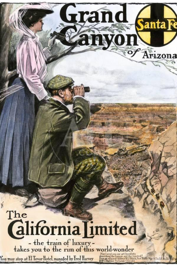
Note. (Ad for Visiting the Grand Canyon Aboard the “California Limited,” Santa Fe RR, 1908)
Note. (Parks Canada, 2009)
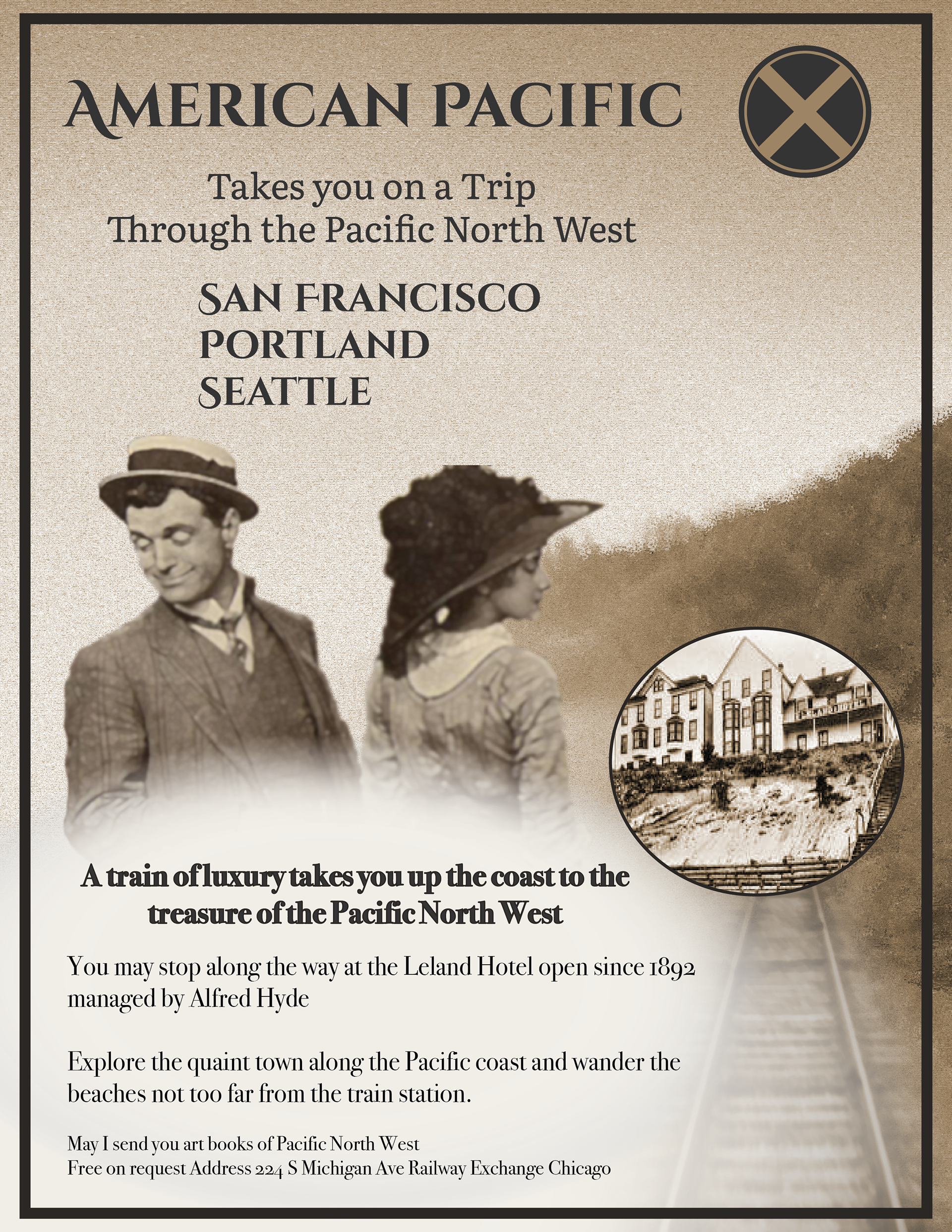
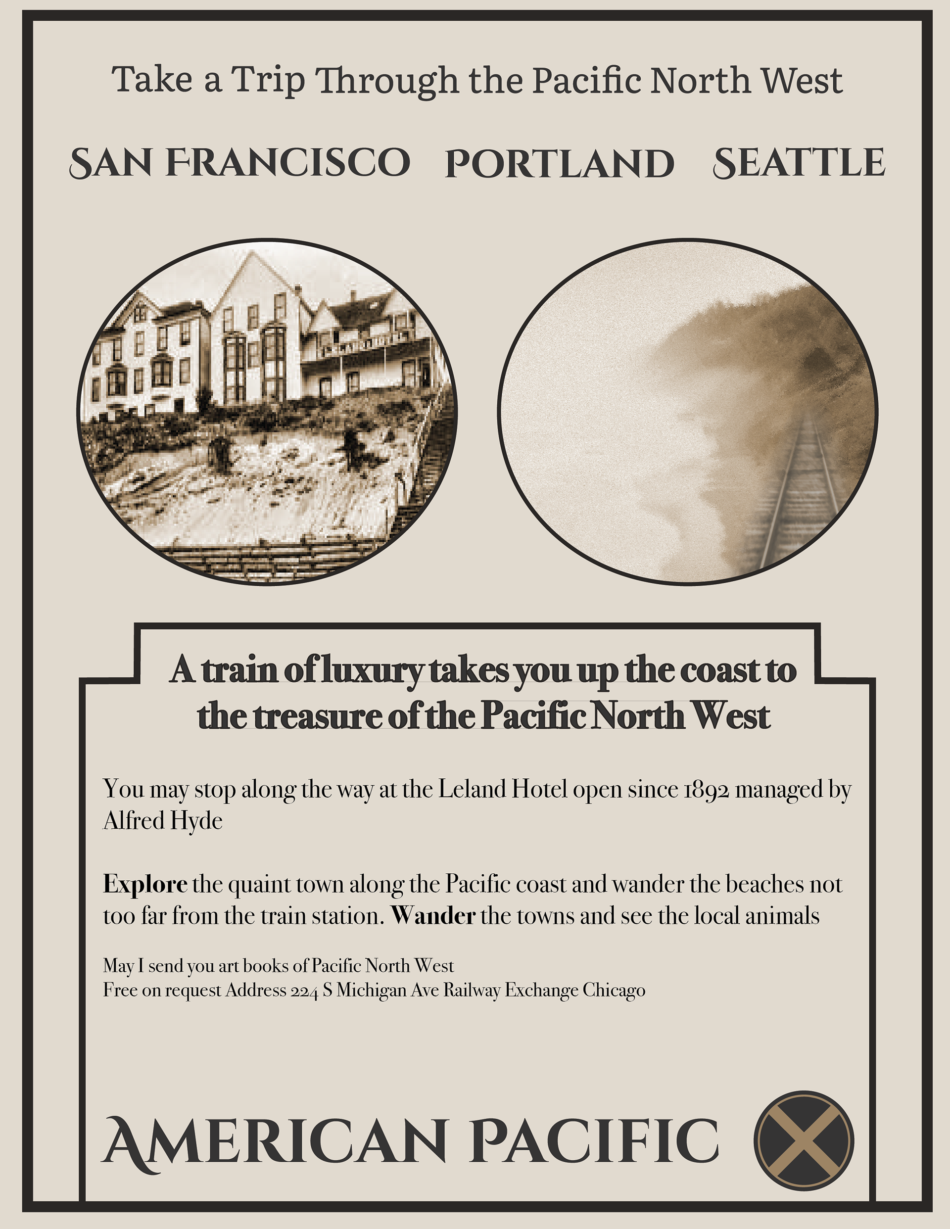
1910s
Modernising the Print Ad
Learning from what worked and did not the decade prior, print ads continued to evolve (DesignCrowd, 2015). Colours were still an expensive addition to an ad however more companies started incorporating them to their advertisements to draw the consumer's eye. Illustrations were still more commonly used than photographs however some companies were starting to invest in their use. Long bodies of text were still needed in a structured way to make it easier for consumers to read.
Learning from what worked and did not the decade prior, print ads continued to evolve (DesignCrowd, 2015). Colours were still an expensive addition to an ad however more companies started incorporating them to their advertisements to draw the consumer's eye. Illustrations were still more commonly used than photographs however some companies were starting to invest in their use. Long bodies of text were still needed in a structured way to make it easier for consumers to read.
Propaganda
Four years into the decade, World War One broke out. Though the war was across the Atlantic, its effects were felt in North America. Propaganda dominated the art of the 1910s. Though America entered the war in its ladder years, there were more propaganda posters produced in the United States than any other country fighting in the war (Library of congress, 2019). The fun American Posters of the 1900s turned into recruitment advertisements for all branches of the military and ways for the everyday citizen to support the war. Perhaps the most iconic propaganda poster of the First World War is Uncle Sam. Due to the popularity of posters pre-war, they became the perfect communication tool, using familiar art styles and a predominantly red, white, and blue theme.
Four years into the decade, World War One broke out. Though the war was across the Atlantic, its effects were felt in North America. Propaganda dominated the art of the 1910s. Though America entered the war in its ladder years, there were more propaganda posters produced in the United States than any other country fighting in the war (Library of congress, 2019). The fun American Posters of the 1900s turned into recruitment advertisements for all branches of the military and ways for the everyday citizen to support the war. Perhaps the most iconic propaganda poster of the First World War is Uncle Sam. Due to the popularity of posters pre-war, they became the perfect communication tool, using familiar art styles and a predominantly red, white, and blue theme.
My design
For the 1910s, I wanted to use the very structured, boxed style forcing the consumer to read the ad in a very structured way. Within the structured text, the use of different font weights and headlines allowed for a flow to the text, so it was not one long block of text. Both a photograph and illustration was used since they could both be found in advertisements of the day.
For the 1910s, I wanted to use the very structured, boxed style forcing the consumer to read the ad in a very structured way. Within the structured text, the use of different font weights and headlines allowed for a flow to the text, so it was not one long block of text. Both a photograph and illustration was used since they could both be found in advertisements of the day.
1910s Inspiration
My 1910s Design
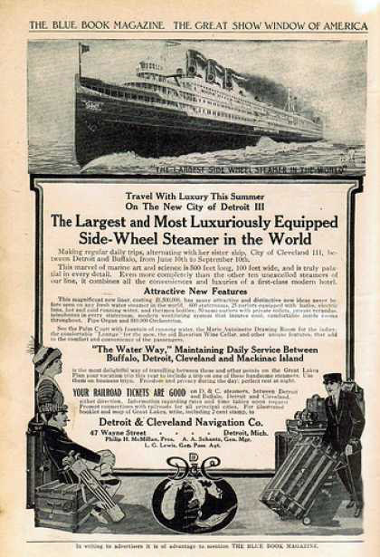
Note. (Detroit & Cleveland Navigation Co., n.d.)
Note. (Parks Canada, 2009)
1920s
Negative Space
Long bodies of text remained prominent in 1920 advertisements. Designs became more dynamic; the art was not bound by a rigid box. Negative space was more heavily utilised (DesignCrowd, 2015). This made advertisements appear less cluttered which allowed the eye to wander in a more organic way rather than being dictated by the bounding boxes of previous decades. The roaring twenties was a time of escapism, which was reflected in advertisements. Promoting post-war prosperity of luxury and excitement of the decade (National Museum of American History, 2015a).
Long bodies of text remained prominent in 1920 advertisements. Designs became more dynamic; the art was not bound by a rigid box. Negative space was more heavily utilised (DesignCrowd, 2015). This made advertisements appear less cluttered which allowed the eye to wander in a more organic way rather than being dictated by the bounding boxes of previous decades. The roaring twenties was a time of escapism, which was reflected in advertisements. Promoting post-war prosperity of luxury and excitement of the decade (National Museum of American History, 2015a).
My design
The 1920s threw out the idea of the structured box which I expressed in my version of a 1920s advertisement. The railway draws the viewer into the image and the idea of travel. Given that more were using colour in their ads, I opted to utilize it.
The 1920s threw out the idea of the structured box which I expressed in my version of a 1920s advertisement. The railway draws the viewer into the image and the idea of travel. Given that more were using colour in their ads, I opted to utilize it.
1920s Inspiration
My 1920s Design
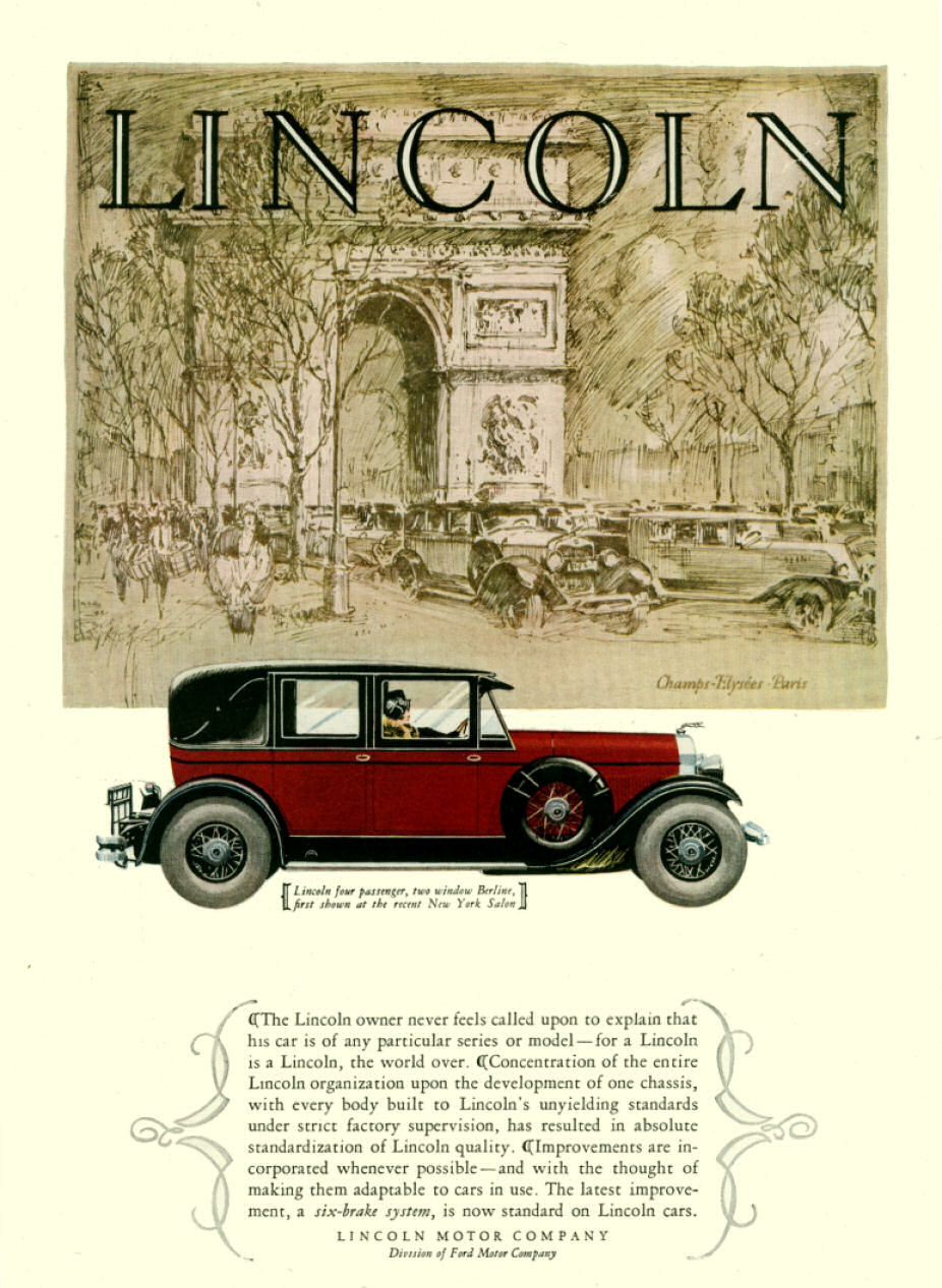
Note. (“Lincoln 1928,” n.d.)
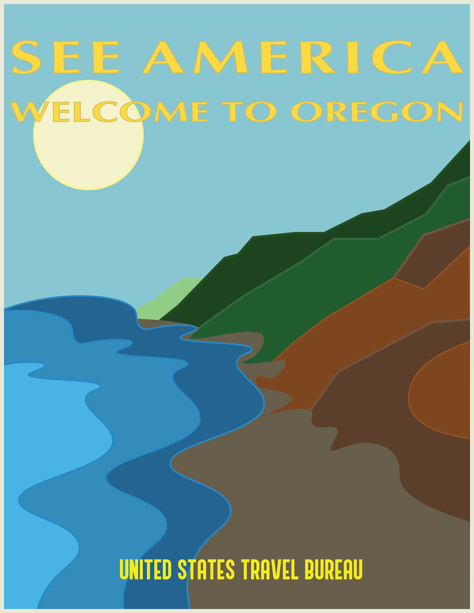
1930s
Due to the Great Depression, advertisement styles did not evolve much from the 1920s (DesignCrowd, 2015).
Due to the Great Depression, advertisement styles did not evolve much from the 1920s (DesignCrowd, 2015).
The “Golden Age of American Illustration”
According to Christies, the “Golden Age of American Illustration” began in the early 1900s and lasted until the mid-20th century (Christie's, 2020). This movement made its way over from Europe where it started a few years previous. The 1900s were an important time for American advertising. Magazine covers drew consumers to purchase the magazine. As Art Nouveau had run its course, American artists were trying to find a new style, “for poster designers to succeed in communicating to the masses, they would have to adopt a more pictorial representation people could better understand.” (Huisinga, n.d., 10). Most magazine covers of the time utilised Poster Style or Pictorial Modernism. Gone were the intricate details of Art Nouveau. Instead, solid blocks of colour were utilised, which also made printing easier.
According to Christies, the “Golden Age of American Illustration” began in the early 1900s and lasted until the mid-20th century (Christie's, 2020). This movement made its way over from Europe where it started a few years previous. The 1900s were an important time for American advertising. Magazine covers drew consumers to purchase the magazine. As Art Nouveau had run its course, American artists were trying to find a new style, “for poster designers to succeed in communicating to the masses, they would have to adopt a more pictorial representation people could better understand.” (Huisinga, n.d., 10). Most magazine covers of the time utilised Poster Style or Pictorial Modernism. Gone were the intricate details of Art Nouveau. Instead, solid blocks of colour were utilised, which also made printing easier.
My design
The 1930s were in the middle of “Golden Age of American Illustration” which is why I decided to design an ad in that style. Big, bold colours outlined the destination for viewers to travel to. The three layers of water cause a dynamic design showing the water crash towards the shoreline, which is what travelers will expect, and will see, once they visit Oregon.
The 1930s were in the middle of “Golden Age of American Illustration” which is why I decided to design an ad in that style. Big, bold colours outlined the destination for viewers to travel to. The three layers of water cause a dynamic design showing the water crash towards the shoreline, which is what travelers will expect, and will see, once they visit Oregon.
1930s Inspiration
My 1930s Design
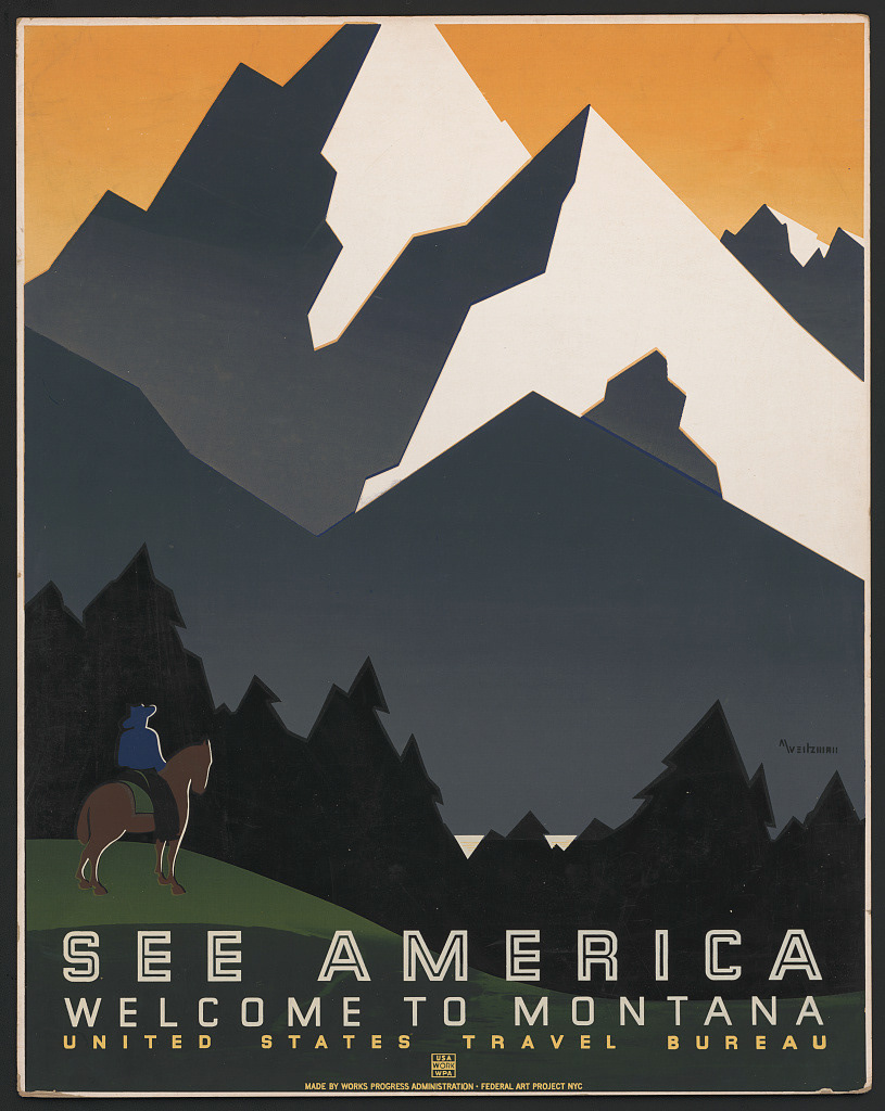
Note. (Weitzman, 1939)
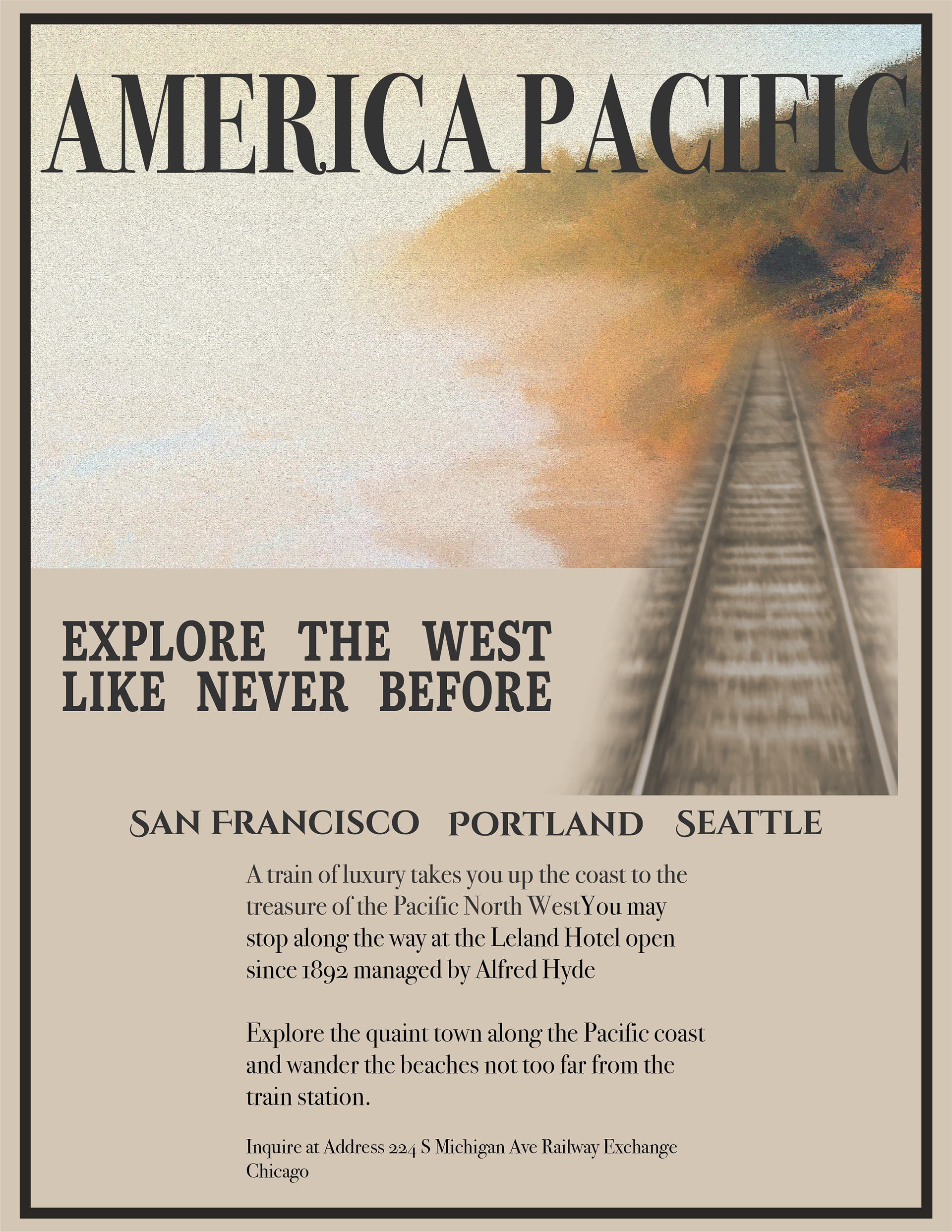
1940s
Patriotism
Everything was about the war effort. Advertisement drew upon citizens' patriotism; American products, war bonds, and exploring America. Money spent needed to stay within the country. Design wise, imagery was the focal point. At this point, many adults had grown up seeing print ads and had learned how to read an ad. They knew they could imagine what the product would do without blocks of text explaining it to them. Advertising expenses became tax deductible which allowed agencies to spend more money on the designs. Original art came back in, colour was used as much as black and white (Pollay, 1985, p. 10).
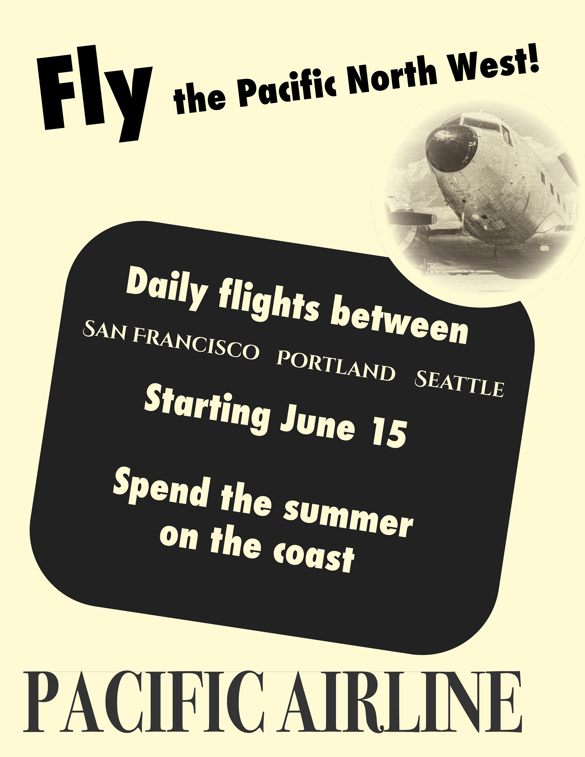
My design
The 1940s were riddled in war. Knowing that many resources were reserved for the army, I tried to simplify the ad as much as possible. Within all the ads of the 1940s, America was the focus which is why I chose an ad for touring around the Pacific North West.
Patriotism
Everything was about the war effort. Advertisement drew upon citizens' patriotism; American products, war bonds, and exploring America. Money spent needed to stay within the country. Design wise, imagery was the focal point. At this point, many adults had grown up seeing print ads and had learned how to read an ad. They knew they could imagine what the product would do without blocks of text explaining it to them. Advertising expenses became tax deductible which allowed agencies to spend more money on the designs. Original art came back in, colour was used as much as black and white (Pollay, 1985, p. 10).
My design
The 1940s were riddled in war. Knowing that many resources were reserved for the army, I tried to simplify the ad as much as possible. Within all the ads of the 1940s, America was the focus which is why I chose an ad for touring around the Pacific North West.
1940s Inspiration
My 1940s Design
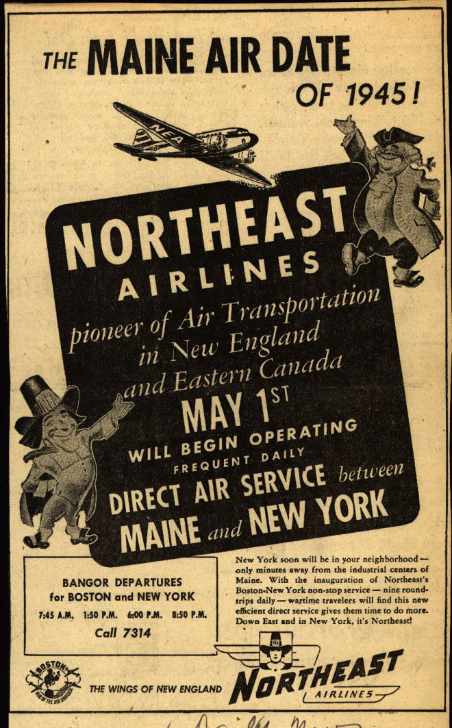
Note. (Northeast Airlines, 1945)
Note (“1940s Propeller Commercial Airplane,” 2016)
1950s
Family values
Text was pushed towards the bottom of advertisements. This allows the eye to wander, take in the imagery of the ad, and then is spoken to from the brand. Though catch phrases had been used in print ads before, the 1950s is when they really started to make an impact. Part of this was due to the testimonials and features of a product that were used at key selling points (Pollay, 1985, p. 10). Both black and white and colour ads were popular, the choice depended on the company’s budget and the style they were looking for. The use of photography was also increased. The quality of images was greater than ever before, and it gave consumers a better idea of the product. However, illustrations were still used but it shifted from the impressionism style of the first half of the decade to a cartoon style that was popular in other types of media (DesignCrowd, 2015).
Text was pushed towards the bottom of advertisements. This allows the eye to wander, take in the imagery of the ad, and then is spoken to from the brand. Though catch phrases had been used in print ads before, the 1950s is when they really started to make an impact. Part of this was due to the testimonials and features of a product that were used at key selling points (Pollay, 1985, p. 10). Both black and white and colour ads were popular, the choice depended on the company’s budget and the style they were looking for. The use of photography was also increased. The quality of images was greater than ever before, and it gave consumers a better idea of the product. However, illustrations were still used but it shifted from the impressionism style of the first half of the decade to a cartoon style that was popular in other types of media (DesignCrowd, 2015).
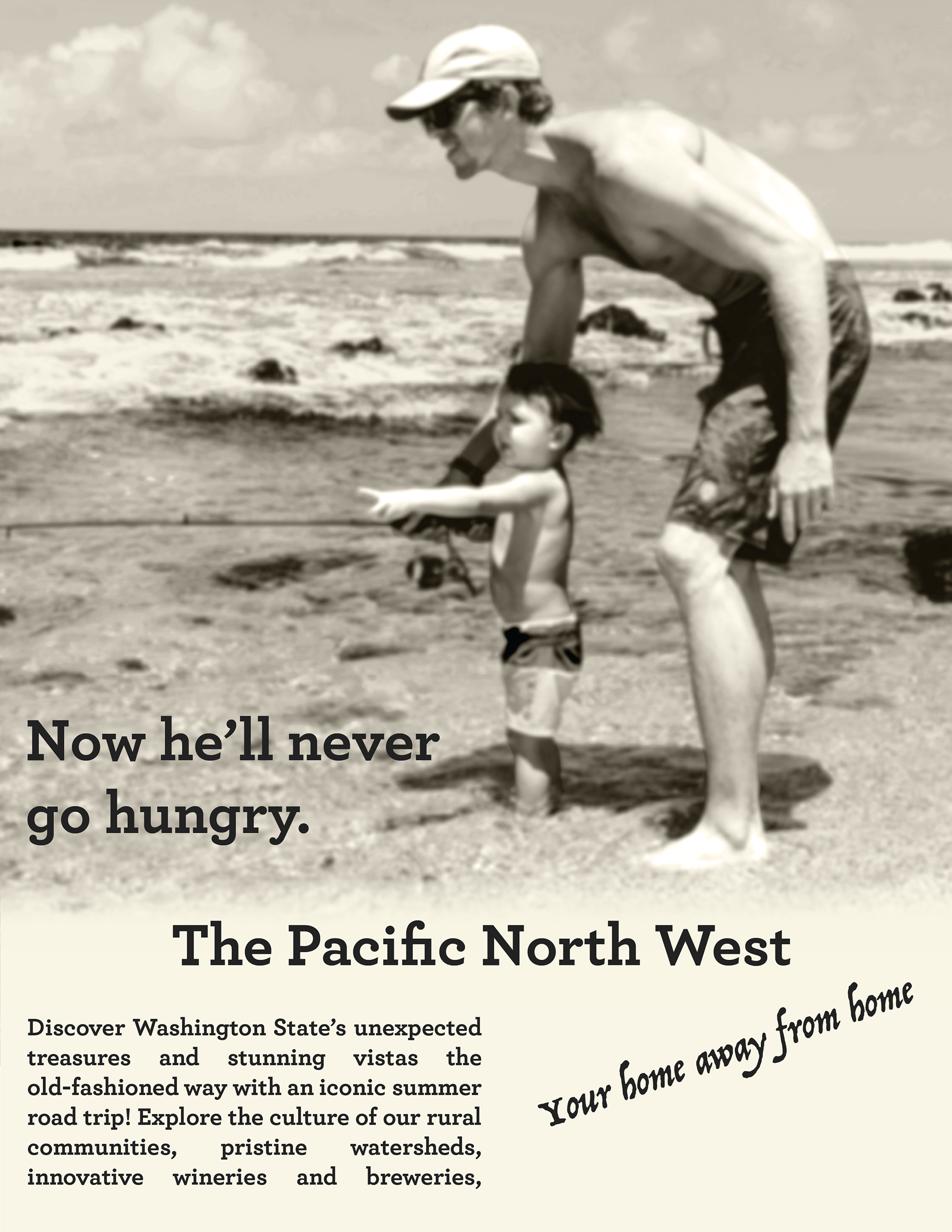
My design
The 1950s was when children born right after the war in the late 1940s were old enough to go on family vacations. Given that black and white ads were just as popular as coloured ads, I created a black and white family vacation ad, with a headline of a father son activity.
The 1950s was when children born right after the war in the late 1940s were old enough to go on family vacations. Given that black and white ads were just as popular as coloured ads, I created a black and white family vacation ad, with a headline of a father son activity.
1950s Inspiration
My 1950s Design
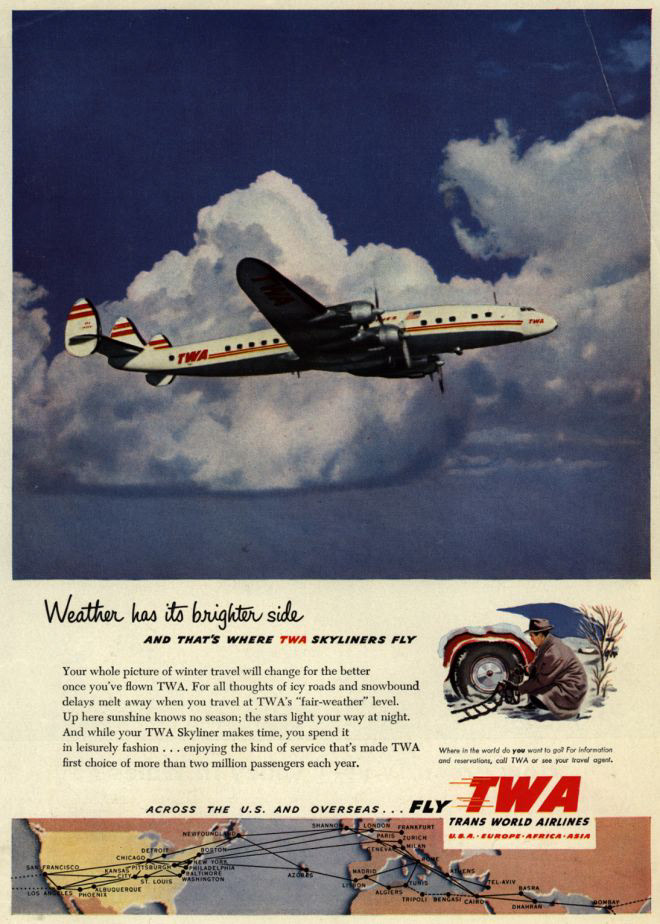
Note. (Trans World Airlines, n.d.)
1960s
The Creative Revolution
The Creative Revolution saw an increase in artists being hired at ad agencies to create more creative and unique advertisements (National Museum of American History, 2015c). The 1960s was a massive cultural shift towards youthfulness and advertisers needed to reflect that in their ads. The 1960s was the decade where photography really dominated advertisements. There was also a shift in terms of the copy. Product attributes were used to describe items rather than testimonials and features (Pollay, 1985, p. 10). Consumers wanted to learn more about the overall product rather than what others thought.
My design
Carrying over the theme from my 1950s ad, I wanted a family-centered youthfulness to the ad. Since photography had really taken hold of ads, two photos were used. In addition, a reference to the funky, hippiness of the 1960s dictated the fonts used.
1960s Inspiration
My 1960s Inspiration
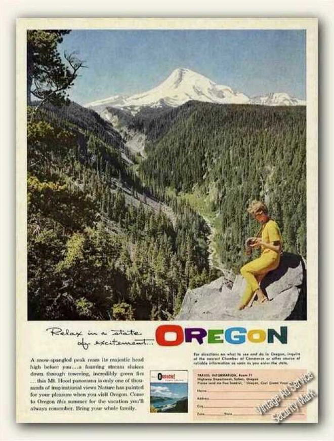
Note. (“Relax in a State of Excitement... Oregon,” n.d.)
1970s
Bright Photography
Though colour was used in decades prior, the 1970s is where colour exploded. “Advertisements in the 1970s tend to use bright photographic images paired with a large headline and body copy” (DesignCrowd, 2015). Often times, images were over saturated to make the ad pop.
My design
This design came together very quickly. The first element I edited when putting together this ad was the colour to the photo. Though not present in the reference ad, researching 1970s ads showed a lot of over saturated colour. A bold headline captures the eye which then wanders down the body text.
1970s Inspiration
My 1970s Design
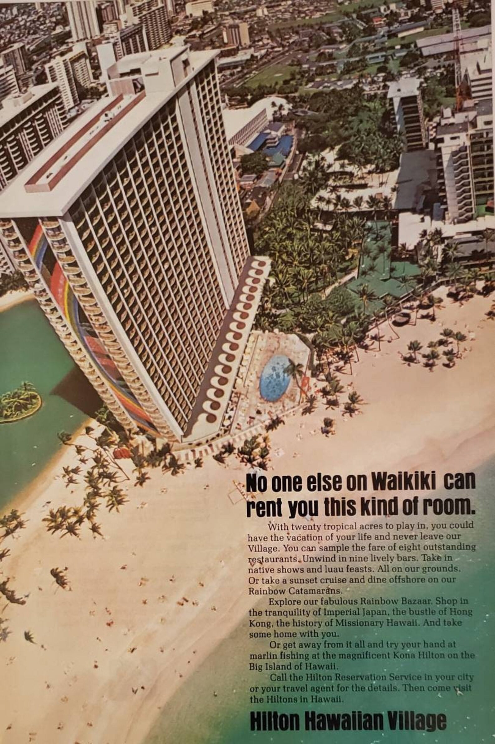
Note. (Hilton Hawaiian Village, 1976)
Note. (The State of Washington, n.d.)
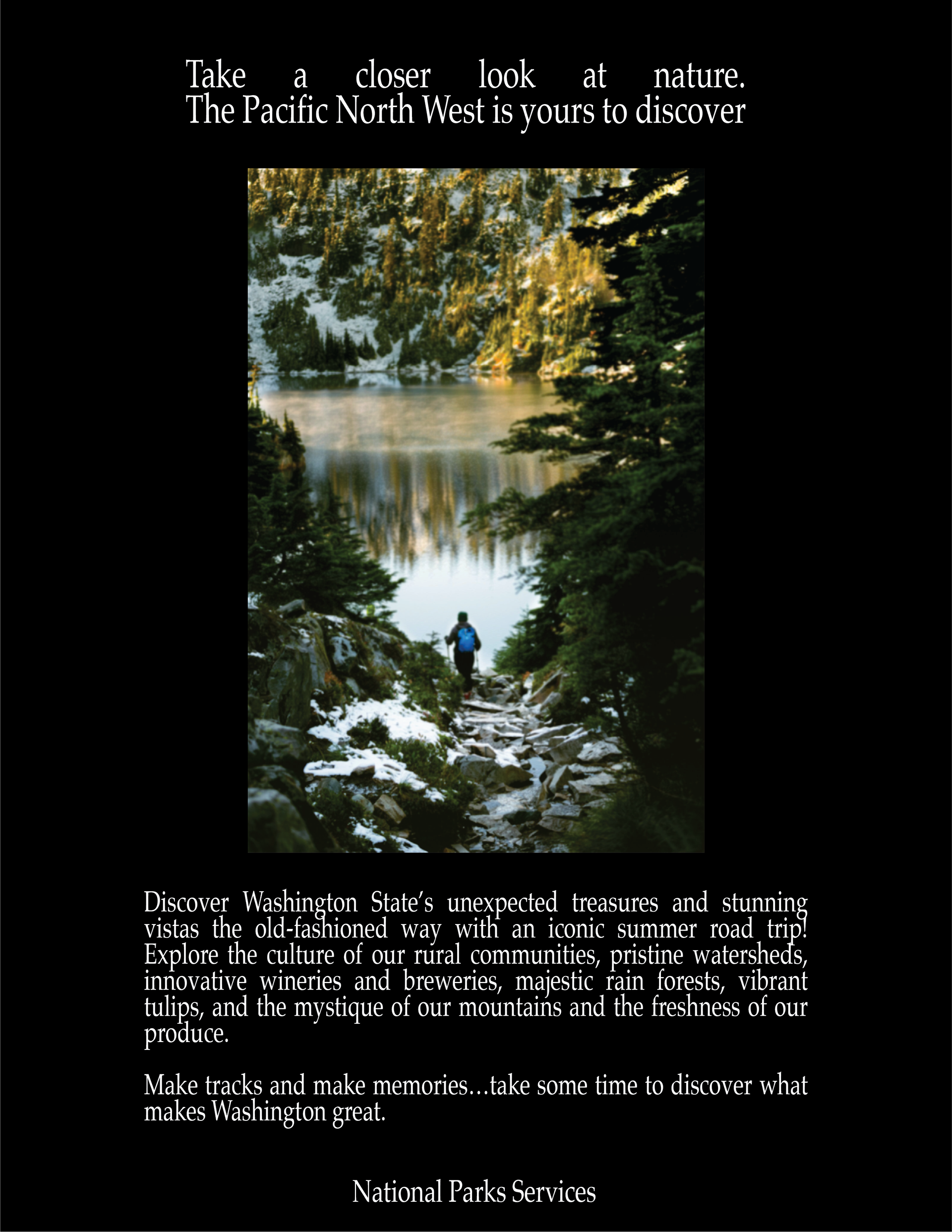
1980s
C'est chic
Though released in the late 1970s, Chic’s C’est chic album would describe the style of the 1980s. Advertisements were sleek and simplified with even less copy than previous years (DesignCrowd, 2015). Messages needed to pop off the page to grab consumers attention (Whitney, 2017). Another huge influence of 1980s advertisement was cultural influence (Merri Meyer and Art Directors Club, 2000). What was happening around the America had always played into advertisement designs (war propaganda being the most well known) but it was brought to the forefront of ad designs with technological advances keeping citizens up to date on what was happening coast to coast.
Though released in the late 1970s, Chic’s C’est chic album would describe the style of the 1980s. Advertisements were sleek and simplified with even less copy than previous years (DesignCrowd, 2015). Messages needed to pop off the page to grab consumers attention (Whitney, 2017). Another huge influence of 1980s advertisement was cultural influence (Merri Meyer and Art Directors Club, 2000). What was happening around the America had always played into advertisement designs (war propaganda being the most well known) but it was brought to the forefront of ad designs with technological advances keeping citizens up to date on what was happening coast to coast.
My design
The simple sleekness of the 1980s was easy to capture in this travel ad. White of black text, especially on a glossy magazine page glows and becomes easy for the viewer to read. Having the hiker walking down towards the lake was strategic as the eye will follow the path and eventually see what the hiker is seeing, thus causing a wanderlust feeling in the viewer.
The simple sleekness of the 1980s was easy to capture in this travel ad. White of black text, especially on a glossy magazine page glows and becomes easy for the viewer to read. Having the hiker walking down towards the lake was strategic as the eye will follow the path and eventually see what the hiker is seeing, thus causing a wanderlust feeling in the viewer.
1980s Inspiration
My 1980s Design
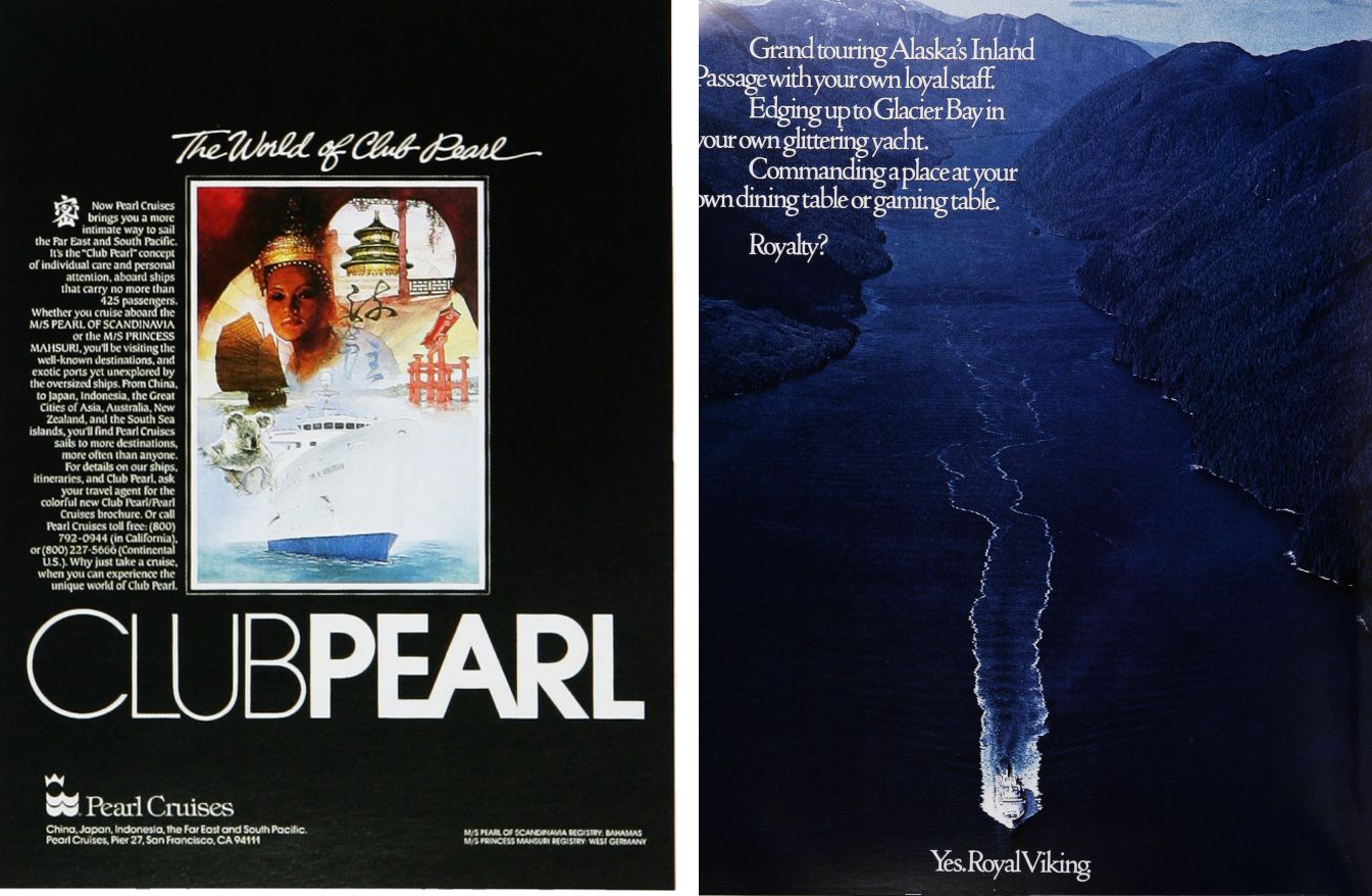
Note. (Pearl Cruises, n.d.), (Royal Viking, n.d.)
Note. (The State of Washington, n.d.)
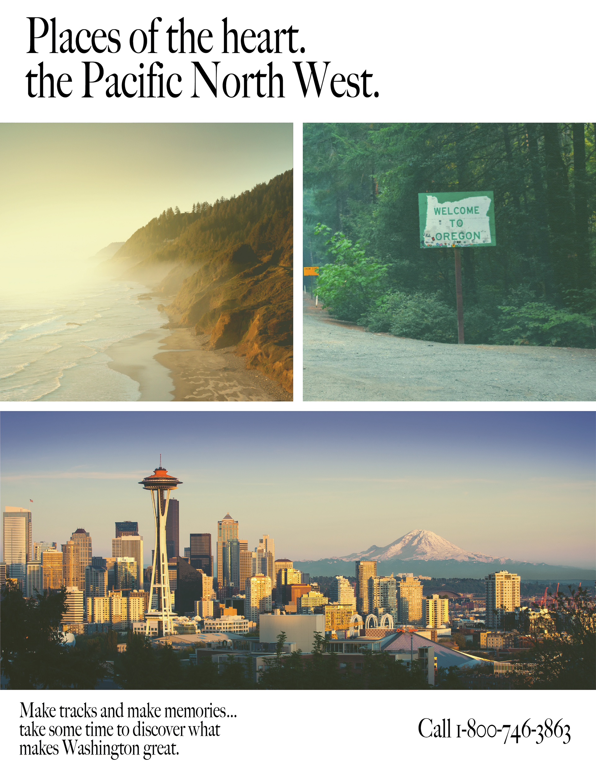
1990s
End of The Century
The simplistic style of the 1980s carried on into the 1990s. Consumers were well aware of most brands at this point, and any new ones could quickly earn their trust through effective ads. Slogans were at the for front of ads, making them memorable. Brands started creating series of ads to target different audiences (Whitney, 2017). In 1990, Photoshop was released to the public which allowed for designers to manipulate their photos and artwork like never before (3Points Communications, 2019).
The simplistic style of the 1980s carried on into the 1990s. Consumers were well aware of most brands at this point, and any new ones could quickly earn their trust through effective ads. Slogans were at the for front of ads, making them memorable. Brands started creating series of ads to target different audiences (Whitney, 2017). In 1990, Photoshop was released to the public which allowed for designers to manipulate their photos and artwork like never before (3Points Communications, 2019).
My design
The 1990s were the beginning of photoshopping. Each image in the ad has been photoshopped; either with temperature, saturation, or colour balance. I wanted as little text as possible to show off the photos. I included a phone numbers as the call-to-action part of the ad.
The 1990s were the beginning of photoshopping. Each image in the ad has been photoshopped; either with temperature, saturation, or colour balance. I wanted as little text as possible to show off the photos. I included a phone numbers as the call-to-action part of the ad.
1990s Inspiration
My 1990s Design
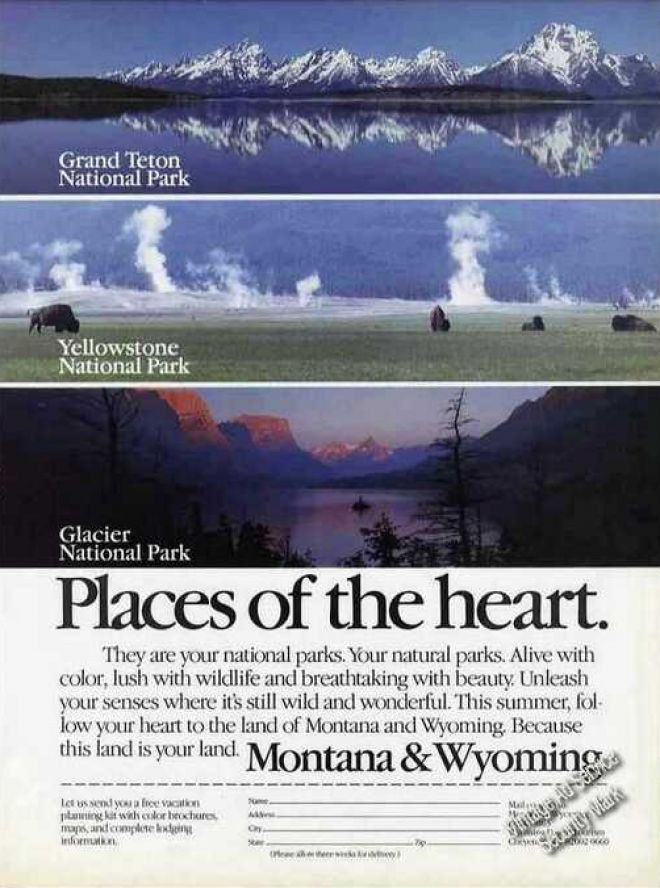
Note. (“Places of the Heart. Montana & Wyoming,” n.d.)
Note. (The State of Washington, n.d.)
2020s
I have been creating ads for businesses since 2017. My personal experience with today’s design styles and trends has seen a shift from the 2010s to 2020s. In the 2020s, high quality pictures are a must. Viewers want to feel as if they are there and can expect to see this exact view when they travel. The saying is “a picture’s worth a thousand words” which is what I used as inspiration. I wanted viewer to be inspired themselves to visit Oregon without words being put in their head about what to expect. The beauty of the state is reason enough to go.
My 2020 Design

Note. (Travel Oregon, 2017)
Conclusion
Visually looking from year to year, slowing moving through the 20th century, you might not see much of a different. Jumping from decade to decade and taking the time to analyse what makes advertisements different makes you see the difference. One of the limits to this research was that a lot of what was learned came from reading a few lines of text from a reference. Many books talk about the graphic design movements of the 20th century or the marketing tactics of advertisements. Most of the detailed analysis came from viewing collections of ads from each decade and making note of notable elements. What became most prominent was how the technological advances changed the ads of each decades. Illustrations to photography, from lithography to mass production printer to photoshop. Yet, we seem to have come full circle with the popularity of illustrations creeping back into modern advertisements. As we have seen in other aspects of art and design, history repeats itself. It will be interesting to analyse the ads of the 21st century and see how they compare to the 20th.
Visually looking from year to year, slowing moving through the 20th century, you might not see much of a different. Jumping from decade to decade and taking the time to analyse what makes advertisements different makes you see the difference. One of the limits to this research was that a lot of what was learned came from reading a few lines of text from a reference. Many books talk about the graphic design movements of the 20th century or the marketing tactics of advertisements. Most of the detailed analysis came from viewing collections of ads from each decade and making note of notable elements. What became most prominent was how the technological advances changed the ads of each decades. Illustrations to photography, from lithography to mass production printer to photoshop. Yet, we seem to have come full circle with the popularity of illustrations creeping back into modern advertisements. As we have seen in other aspects of art and design, history repeats itself. It will be interesting to analyse the ads of the 21st century and see how they compare to the 20th.
References
3Points Communications. (2019, November 18). Design Through the Decades: The Evolution of Graphic Design over the Last 50 Years… and Beyond. Medium. https://3ptscomm.medium.com/design-through-the-decades-the-evolution-of-graphic-design-over-the-last-50-years-andbeyond-617a20f8b61d
1940s propeller commercial airplane. (2016). [Photograph]. In USA Today. https://www.usatoday.com/story/travel/roadwarriorvoices/2016/01/20/lie-flat-beds-single-stewardesses-indestructible-luggage-this-is-what-is-was-like-to-fly-in-the-1940s/83304624/
Ad for visiting the Grand Canyon aboard the “California Limited,” Santa Fe RR. (1908).
Baker Library Historical Collections. (n.d.). The Art of American Advertising: Brand Name Management. Harvard Business School. Retrieved April 9, 2022, from https://www.library.hbs.edu/hc/artadv/brand-name-management.html
Christie's. (2020, May 20). Collecting Art: Buying Guides, News & Auctions | Christie’s | Christie’s. Christies. https://www.christies.com/features/Collecting-Guide-to-American-Illustration-10481-3.aspx
DesignCrowd. (2015, December 14). The 100 Year Evolution of Print Ads. DesignCrowd; DesignCrowd. https://blog.designcrowd.ca/article/269/the-100-year-evolution-of-print-ads
Detroit & Cleveland Navigation Co. (n.d.). The Largest and Most Luxuriously Equipped Side-Wheel Steamer in the World, Detroit & Cleveland
Navigation Co. [Online Image]. In Vintage Ad Browser. Retrieved April 18, 2022, from https://www.vintageadbrowser.com/travel-ads-1910s
Hilton Hawaiian Village. (1976). No one else on Waikiki can rent you this one of a kind room. Hilton Hawaiian Village [Online Image]. In Vintage
Ad Browser. https://www.vintageadbrowser.com/travel-ads-1970s/2
Huisinga, L. (n.d.). PICTORIAL MODERNISM. California State University, Fresno Department of Art and Design. Retrieved April 7, 2022, from http://fsartanddesign.org/courses/huisinga/GD135/_IMG/slides/Ch14Lecture.pdf
Library of congress. (2019). Posters: World War I Posters - Background and Scope - Prints & Photographs Online Catalog (Library of Congress). Loc.gov. https://www.loc.gov/pictures/collection/wwipos/background.html
Lincoln 1928. (n.d.). [Online Image]. In Old Car Advertising. Retrieved April 9, 2022, from http://www.oldcaradvertising.com/Lincoln/1928/1928%20Lincoln%20Ad-04.html
McCoy, K. (1990). American Graphic Design Expression. Design Quarterly, 148, 3–22. JSTOR. https://doi.org/https://doi.org/10.2307/4091231
Merri Meyer, J., & Art Directors Club. (2000). Mad Ave : award-winning advertising of the 20th century. Universe Pub.
National Museum of American History. (2015a, June 22). An Industry and Cultural Force. National Museum of American History. https://americanhistory.si.edu/advertising-business/industry-and-cultural-force
National Museum of American History. (2015b, June 22). Establishing the Business. National Museum of American History. https://americanhistory.si.edu/advertising-business/establishing-business
National Museum of American History. (2015c, June 23). Madison Avenue. National Museum of American History. https://americanhistory.si.edu/advertising-business/madison-avenue
Northeast Airlines. (1945). The Maine Air Date of 1945. Northeast Airlines [Online Image]. In Vintage Ad Browser. https://www.vintageadbrowser.com/travel-ads-1940s
Parks Canada. (2009). Leland Hotel, 1920s, Village of Nakusp [Photograph]. In Canada’s Historic Places. https://www.historicplaces.ca/en/rep-reg/place-lieu.aspx?id=18590
Pearl Cruises. (n.d.). Club Pearl [Online Image]. In Vintage Ad Browser. Retrieved April 10, 2022, from https://www.vintageadbrowser.com/travel-ads-1980s
Places of the Heart. Montana & Wyoming. (n.d.). In Vintage Ad Browser. Retrieved April 10, 2022, from https://www.vintageadbrowser.com/travel-ads-1990s
Pollay, R. W. (1985). The Subsiding Sizzle: A Descriptive History of Print Advertising, 19001980. Journal of Marketing, 49(3), 24–37. https://doi.org/10.2307/1251613
Relax in a state of excitement... Oregon. (n.d.). [Online Image]. In Vintage Ad Browser. Retrieved April 10, 2022, from https://www.vintageadbrowser.com/travel-ads-1960s/3
Royal Viking. (n.d.). Grand touring Alaska’s Inland [Online Image]. In Vintage Ad Browser. Retrieved April 10, 2022, from https://www.vintageadbrowser.com/travel-ads-1980s/2
The State of Washington. (n.d.). Home. WA Itineraries; The State of Washington. Retrieved April 10, 2022, from https://waroadtrip.com/
Trans World Airlines. (n.d.). Weather has it’s brighter side and that’s where TWA skyliners fly. In Vintage Ad Browser. Retrieved April 10, 2022, from
https://www.vintageadbrowser.com/travel-ads-1950s/4
Travel Oregon. (2017). Travel Oregon. Travel Oregon. https://traveloregon.com/
Weitzman, M. (1939). See America. Welcome to Montana [Poster]. In Library of Congress. https://www.loc.gov/item/96503136/
Whitney, M. (2017, July 20). 11 Well-Made Print Advertisements From the Last Century (And How They Hold up Now). HubSpot. https://blog.hubspot.com/marketing/11-well-made-print-advertisements